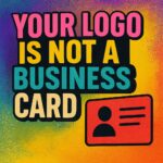
A Logo is an Icon. Period
Logos are everywhere. On your sneakers, your phone, your favorite energy drink. You literally see logos more often than you see your neighbor. And yet… somehow… people still get it wrong. A logo is not a mini brochure. It’s not your signage. It’s not your business card. It’s your face. Your brand. Your instant recognition.
Let’s Talk Red Bull
Think about Red Bull. When you see that logo, you don’t need their phone number to know who they are. You don’t need a list of services to know what they do. The logo alone is enough to spark everything: drinks, sports, events, adrenaline, even a guy jumping out of space. No address. No WhatsApp number. No bullet points. Just an icon.
Simple ≠ Boring
A logo should be simple enough to recognize at a glance — even on a tiny app icon or the corner of a billboard whizzing past at 120km/h. Your logo is not supposed to say everything. It’s supposed to mean everything. There’s a huge difference.
The Common Mistake
Here’s what happens: Someone starts a new business. They want the world to know everything they offer. So, they try to cram it all into one logo. The result? A cluttered mess that looks like the back of a flyer from 2003.
Logos Are Meant to Be Iconic
Your logo is your trademark. Your stamp. It’s the image people tattoo into their memory when they think of your company. If your logo needs a list of services to make sense, it’s not a logo — it’s a billboard. And that’s not what we’re doing here.
Bottom Line
A logo isn’t about telling your whole story. It’s about creating an image that makes people say: 'Oh, I know them.' That’s it. That’s the magic. So the next time you’re tempted to add your address, number, and services into your logo, take a deep breath and remember:
- ● Your logo is your face.
- ● Your business card is your business card.
- ● Don’t confuse the two.
Tip of the Week:
Think iconic, not informational. Your logo should whisper your brand identity, not shout your contact details.